Hello everyone,
The moment we had all been waiting for is finally coming. Today, we are pleased that announced that Perception is now available for pre-order. The photos which you will see later on are of prototypes which the productions pieces will be very close to. There is going to be a number of marginal improvements at mass production stage, but those will mainly concern tiny, almost hidden details and, as such, it is safe to say that the next pictures are representative of what actual Perception watches will look and feel like.
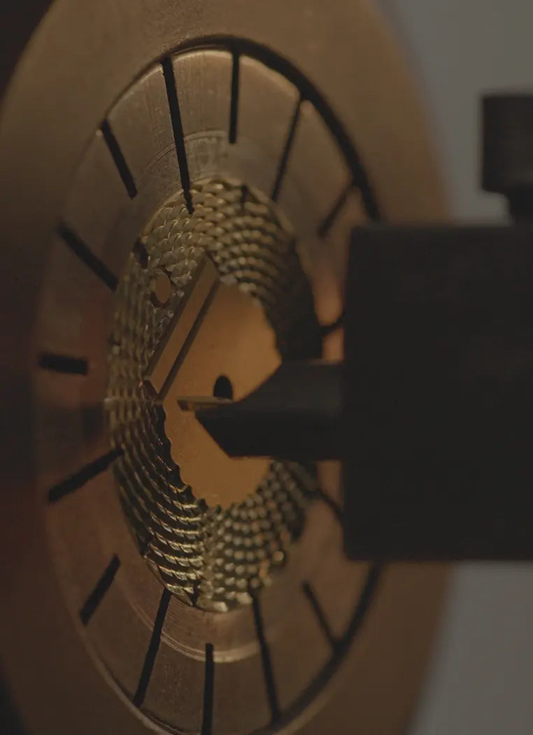
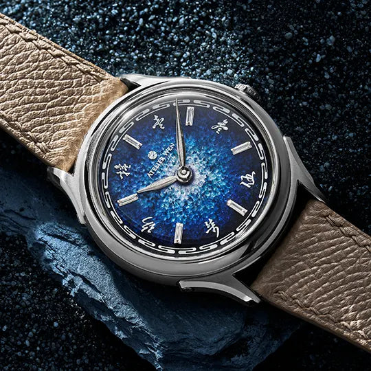
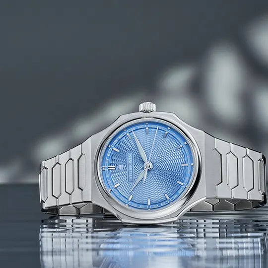
If you are just joining us, please be aware that a sizeable series of article has already been published about the series’ development. In Part 1, we introduced the series from a conceptual standpoint and explained its design. In Part 2, we shared with you late-stage 3D renders (i.e. just before the manufacturing process began) and shed light on how we intend to do surface finishing and on why we chose the name “Perception”. In Part 3, we focused on the lengthy clasp development process, explaining how we designed what we feel is one of the best claps ever. In Part 4, we announced the series’ most important feature i.e. that Perception dials will be handmade guilloché with a rose engine by China’s and Asia’s sole guilloché master craftsman, Cheng Yucai. Lastly, in Part 5, we told you more about Master Cheng’s incredible life story. If you have not read those, I suggest you have a look first.
Also, if you just want to see pictures of the watches or lean about the pre-order details, skip the following introduction and scroll down!
A long introduction
It feels particularly exhilarating to be at the end of the series development and launch process. We kicked off the development of Perception in late December 2018; I still remember clearly this day: both Wilfried and I had left HK for end-of-year celebrations, and, due to time zone issues, I joined a 5am introduction call from the typical Mediterranean winter cold of my parents’ living room. Back then, the concept was to be significantly different from what is is now. “Series 2”, as it was known at this time, was not meant to be of the quality level Perception is currently at. There would be no real handmade guilloché dial, no 904L stainless steel case and bracelet, no customised extra-thin movement, no semi-display caseback, no on-the-fly micro-adjustment clasp… None of what make Perception a truly exceptional and unique piece would be there. The concept was simply to have a positioning relatively similar to the one of Porcelain Odyssey, with a sportier profile.
The idea that this second series could be our take on the growing “steel sport chic” trend came quickly after we came back to HK. Back then, it was not necessarily this obvious that the category would encounter such a huge boom; remember, it was a time where you could get a 5711 for c. $50k and an Aquanaut for roughly $20k… Most of the “steel sport chic” alternative pieces were not yet born either: no Czapek Antarctique, no Chopard Alpine Eagle, no Bell&Ross BR05, no Zenith Defy Classic, no Laurent Ferrier Grand Sport, etc… Had we been able to complete Perception’s development on time, we would actually had launched at the same time as all the aforementioned references. But anyway, in hindsight, it was a blessing in disguise we had to lengthen the timeline.

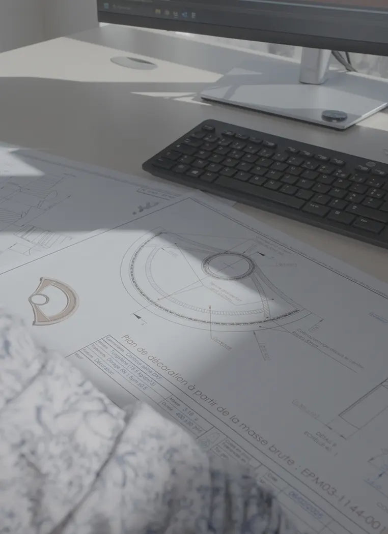
The case and the bracelet were conceptualised quickly, and by April 2019 they were 90% like what Perception is today. The caseback, back then, was not yet semi-display and the detailing and surface finishing were not as meticulous as they are today. But still. Things were moving fast. What however took a really long time to design were the dials. It was challenging, because they needed to bring horological value, to be in tune with the series’ overall concept and inspiration, to enable our identity and mission to shine, and, finally, to be the founding stone of the brand’s nascent design language i.e. how do we ensure that when people look at a Porcelain Odyssey and a Perception simultaneously, they understand that these two come from the same brand? We tried many different concepts, a good 100+, yet we were never satisfied.

Some dial concepts we tried yet did not like
Designing the dials was proving very frustrating, as we were not moving an inch forward. I feel like the more we were trying, the more we were getting stuck into a sort of design paralysis. In May 2019, we launched Atelier Wen in Mainland China, yet things did not go as expected and performances were disappointing. We were far away from the budget we had built, and we quickly entered into a difficult cash-flow situation: we had to pay all our suppliers, yet we did not generate the revenues we expected in Mainland China. The solution to this crisis was to cut every other expenses and scale down all our activities. In a matter of a few days, all marketing stopped, “Series 2” was shelved, and we quietly left HK (a rather difficult experience, trust me).

It would take more than a year for work on Series 2 to resume. After leaving HK, things unfolded in a better way than initially hoped for. Both Wilfried and I found other professional opportunities, we released the Green, Red and Purple Hao special editions, which were commercial successes, and the remaining stock of regular Hao and Ji sold out quickly. In late spring 2020, we had almost no inventory left and we were wondering what to do. We had a great Series 2 case and bracelet ensemble ready, so it did not take us long to decide to resume its development. Candidly, we ignored the design difficulties we faced one year before in HK and believed it would not take long to come up with a great dial. How wrong were we.
While we were deciding to move forward with the development of Perception, we had a long reflection period and came to the conclusion that, in order to properly celebrate Chinese culture and craftsmanship like we want to do, we would need to become one of the single best Chinese watch brands. So, in a way, there is a little bit of a strategy shift vs when we created Porcelain Odyssey. We want to become one of the very best Chinese watch brands instead of just a premium lifestyle label, and Perception is somewhat of the stepping stone for this new path.
This thus means very little to no compromises in what we do, unlike with Porcelain Odyssey where we were heavily cost conscious in our manufacturing choices (e.g. Porcelain dials could have been made and painted by hands rather than in a factory). This is why we, early on, in this second development phase, decided that we would a. go for a true métier d’art dial and b. step up overall quality level significantly.
Li Mingliang and Liu Yuguan joined back the team and started working on the dial. The Sunmao dial structure idea was quickly adopted, and, a little later, we agreed to do real, handmade guilloché. How we found Cheng and convinced him to work with us will be a story for another time. In the meantime, though, I invite you to read the two articles we published regarding our work together.

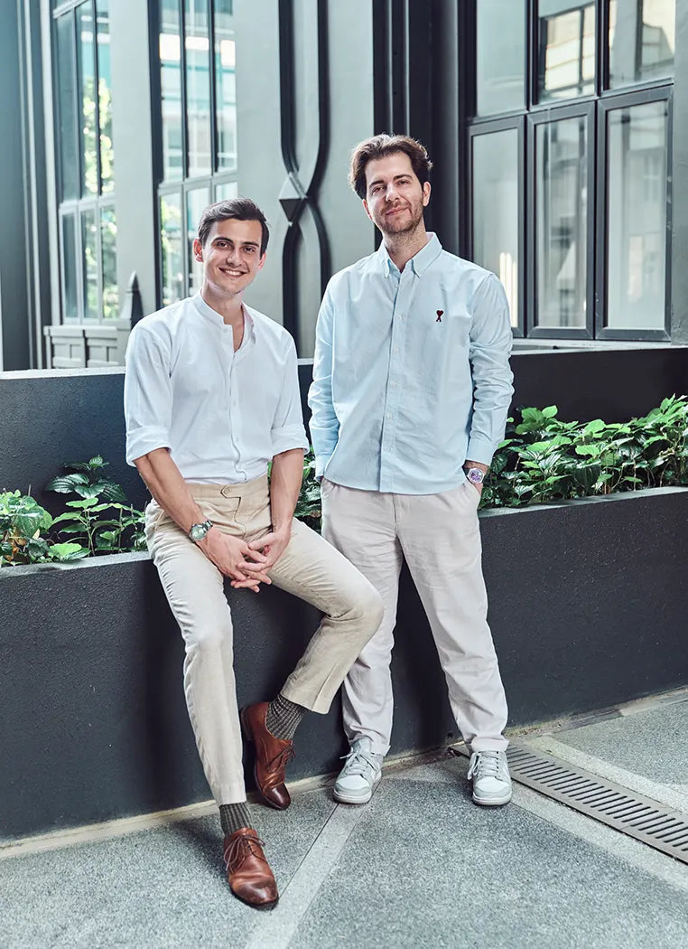
The two designers behind Atelier Wen: Li Mingliang (L) and Liu Yuguan (R)

Dial's Sunmao architecture
And then, on December 24th, we posted the following on Instagram. It was the very first time ever we were publicly discussing Perception. We got some great feedback, which sincerely comforted us in our design and strategic orientation choices.

The very first time we posted about Perception
What happened afterwards is covered in the various journal entries we have published here. Why did it take this long from then on to reach the end of the development process, you may ask. In a nutshell, an insane amount of details and a particularly complex dial to realise.
But there we are. The final prototypes are in our hands, and the series will officially debut on Monday April 18th. Finally.
Without any further ado, let me now introduce each of Perception 3 variants. Let’s dive in!
Introduction to the series' design
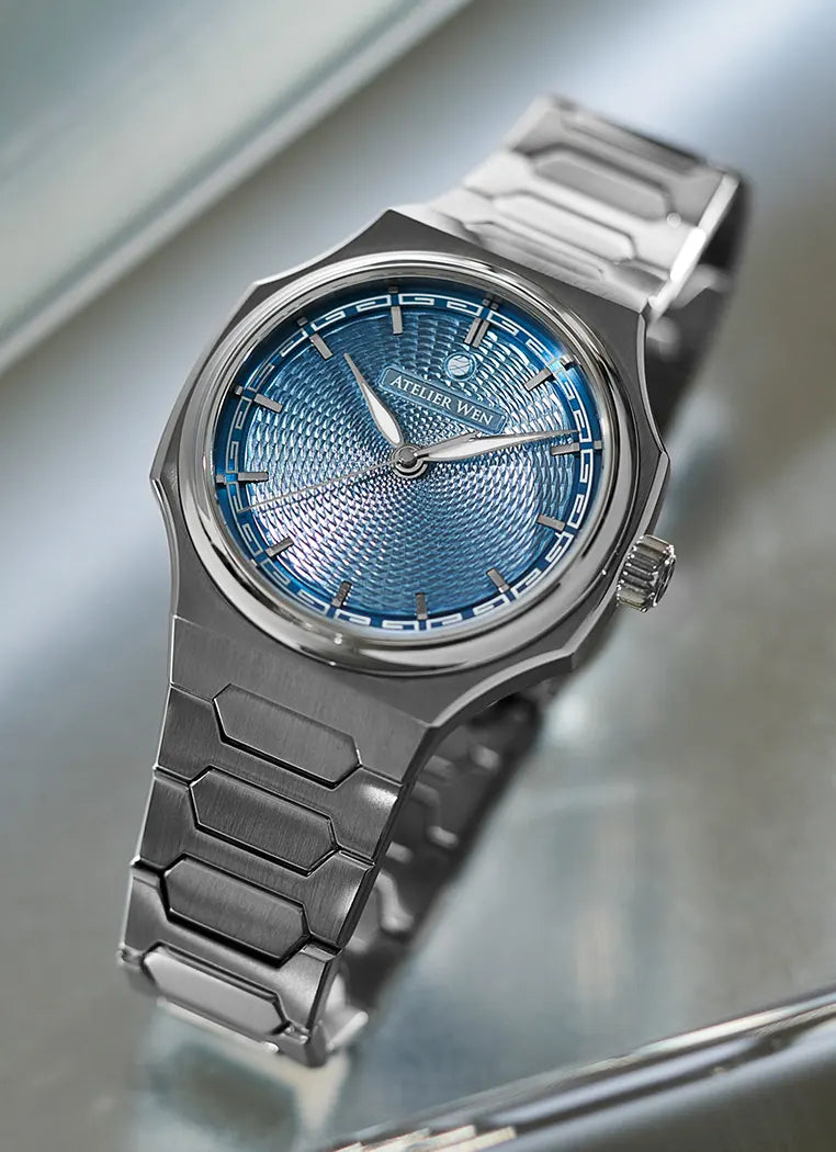
The design of Perception was guided by key Chinese architectural principles which have been re-interpreted to fit a watch format. The sides of the case are inspired by the curved silhouettes of Chinese pagodas, while the top of the lugs feature gently curved angles also reminiscent of roof structures. Furthermore, the central links of the steel bracelet boast the same hexagonal shapes found throughout many elements of Chinese architecture including pagodas and windows. The dial has the same Sunmao structure (mortise and tenon) of many ancient buildings with its four different layers nested into each other and holding through imbrication.

The case
The case is made of 904L stainless steel and its shape is a reflection of different Chinese architectural characteristics. Its sides are inspired by the curved silhouettes of Chinese pagodas, while the top of the lugs also feature gently curved angles reminiscent of roof structures.
Spectacular attention to finish has been paid with sharp angles and contrasting surface treatments. Care has been applied to make the horizontal and vertical brushing particularly noticeable, almost clashing with mirror-like polished areas. The fact that 904L has been used make them even shinier and amplify this visual impression.
The case is extremely thin: just 9.4mm thick, including caseback and crystal and thanks to its layered construction, it wears even thinner. Despite this, the watch is water-resistant to 10 ATM, meaning that you can engage in pretty much any nautical activity with it.
Lug to lug distance is 40.1mm up until the part where the lugs start slopping down.
It features a thick double-domed sapphire crystal with 5 layers of anti-reflective coating, ensuring perfect transparency and readability.

The bracelet
The bracelet is also crafted in 904L stainless steel and its central links feature the same hexagonal shapes found throughout many elements of Chinese architecture including pagodas and windows. The same spectacular attention to finish has been paid with a strong vertical brushing throughout and sharp, mirror-like chamfers on the edges. The tightness between the links gives the illusion of a continuous piece of metal and the sharp chamfers immediately capture sight and are akin to a dynamic path instantly leading to the case and dial.
The bracelet features quick-release spring bars, and is complemented by a fully custom clasp with an on-the-fly micro-adjustment mechanism. Made of no less than 25 parts, it is operated through a large, central push button. It is extremely sleek, intuitive and satisfying to use: all is needed to do is to push the large button to either loosen or tighten the fit. You don’t even need to remove the watch from your wrist.
The caseback
Perception has a semi-display caseback which allows for movement viewing while still having a nice, deeply embossed figure.
It depicts a 石狮子 or Shishi which is a stone guardian lion that you can find at the entrance of most temples and major old buildings. It was meaningful for us because the whole series is inspired by traditional Chinese architecture, and those guardian lions are an important aspect of it. The actual figure we display has been conceptualised by Liu Yuguan using cloud-like strokes, in keeping the somewhat surreal character we want the watch to convey.
When the rotor is aligned with the window, it almost looks like the lion is laughing, which contrats quite starkly with the sobriety and almost brutalist character of the rest of the watch. This is very much aligned with the series' ethos as we intended it to be a watch that can convey a wide pallet of emotions, that can be seen and understood from many different angles, and, therefore where everything is a matter of perception (hence the name).
The movement
The movement in Perception is a customised extra thin Dandong movement based on their new SL1 architecture. It is known under the reference SL1588. We are currently working on removing the ghost position (very likely) and adding a hacking mechanism (possible) for the production models.
Modifications include a slightly, slightly slimmer profile, extra accuracy (it leaves the factory at +/- 10s/d whereas Peacock movements usually leave at +25/-15s/d) and a longer power reserve (c. 41 hours vs c. 38 hours for the range).

The dial
The dial has a Sunmao construction, a structuring approach which was used in ancient Chinese architecture and which consists in complex buildings created without a nail or glue. This is possible thanks to a system of mortise and tenon joints which provide stability. The whole of Perception’s dial follows this principle: on a first copper base sit two additional layers, one which is 0.5mm thick and the other one which is 0.4mm thick. In those are 12 cutouts that are for the raised indexes which neatly nest into them. Each index has a mortice which is designed to receive an elevated chapter ring (a tenon!) which then locks in the indexes.
The hands and indexes are rhodium-plated. The hands are leaf-shaped, in keeping with what was one of Porcelain Odyssey’s defining design features. The question of design language and continuity is one which kept us rather busy and working around leaf hands was one way we went about it. They have been beefed up in order to be aligned with the watch’s sporty character: they are wider, lumed with Superluminova X1 BGW9 and have hand-bent tips in order to make them more voluminous. To this end, the second hand also has a tubular shape.
A huiwen pattern has been printed using lume on the elevated chapter ring. It can be broken down into 60 segments, making it perfectly functional and not solely decorative. Using this signature huiwen pattern is another way we are trying to address the topic of design continuity.
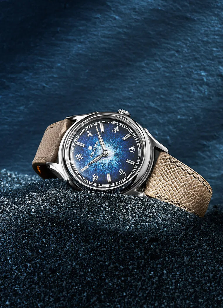
缥 (Piao): An ethereal, misty blue
缥 (Piao) denotes a blue that is ethereal, silky and misty. It does not have a fixed appearance, and is meant to change based on environment and lighting, which is indeed the case with Perception. It is reminiscent of vague images and sceneries, such as the looming appearance of distant mountains or the almost nostalgic beauty of a river waking up at the dawn of spring, fuelled by melting snow. It is hazy, elusive and hard to describe. Blue waves flowing peacefully to a distant place where the water and the sky meet.
The colour was explored in Wu Jun’s famous “Letter to Zhu Yuansi” essay where the Liang dynasty poet, historian and official presents to his friend Zhu Yuansi a charming picture of the landscape around the Fuyang River, in today’s Zhejiang province.
影 (Ying): An elusive, intangible grey
影 (Ying) denotes the colour of shadows and reflections. While we are all familiar with these concepts, their colours are hard to describe and almost intangible. They vary in shades based on environment and lighting, ranging from almost black to a warm, burnt espresso colour. It can also allude to the concepts of insinuation, fuzz and impressions. What those all have in common is their elusive, almost magical realist character.
影 (Ying) comes with heat-blued hands in order to enhance the dial dynamism.
霞 (Xia): A burning copper
霞 (Xia) denotes the colour of the sky at sunset. Also known as “afterglow”, it refers to colourful bright and golden red clouds appearing just after sunset and caused by the scattering of fine dust particles suspended in the high atmosphere. Ranging from light purple to deep, vivid red, it conveys the impression of a burning sky. The phenomenon is mentioned in Yuan You, a short story in the Songs of Chu (dating back to the Warring States period) where it is referred to as an elusive place floating above the clouds where one is able to find its soul.

What's next?
The pictures you have just seen are of prototypes, which nature imply that they are not perfect nor “final”. The following quality improvements will be conducted during production:
-Slightly wider bracelet so that it is perfectly aligned with the case;
-Better (i.e. more neat) printing quality on the dial;
-Stronger lume on both the dial and the hands;
-Better quality hands - we are already working with a new supplier;
-Tougher QC in terms of pattern consistency and overall alignment with the indexes;
-Chamfering inside the indexes cutouts so as to make the overall less rough;
-Removal of the movement’s ghost position;
-Slightly more mat finish on the embossed Shishi;
-Overall surface finishing improvements on the case and bracelet;
-Shorter FKM rubber straps.
-Anything else we spot and believe we can improve;
-Chamfering of some of the very sharp angles on the clasp and lugs in order to make the watch more pleasant to hold.
If you have any questions, please do not hesitate to send us an email.
Thank you!
See you soon,
Wilfried and Robin


